Redesigned Canvas UX, leading to a 64% overall improvement in student experience.
My Role
Research and Design
Timeline
2 months
Team
Tejasree Mandava, Jovi Thomas, Rahul Parmar

What is a CANVAS?
Canvas LMS is a widely adopted digital learning platform used by colleges and universities to manage course content, assignments, grades, and communication between students and instructors.
Problem Statement
Students struggled to navigate Canvas due to inconsistent layouts and content redundancy, leading to confusion, missed submissions, and a disrupted learning experience.
Objective
Redesigning the Canvas LMS to streamline navigation, improve visibility of course content and deadlines, and ensure layout consistency. The goal is to help students stay organized and manage their coursework with confidence.
Our Process
We followed a structured process to redesign CANVAS, conducting multiple rounds of testing. We tested from the original system to low-fidelity, mid-fidelity, and beyond. At each stage, we gathered data and analyzed it to measure our improvements.

Research
Define
Ideate
Design

Test
Research
Redesigning the Canvas LMS to streamline navigation, improve visibility of course content and deadlines, and ensure layout consistency. The goal is to help students stay organized and manage their coursework with confidence.
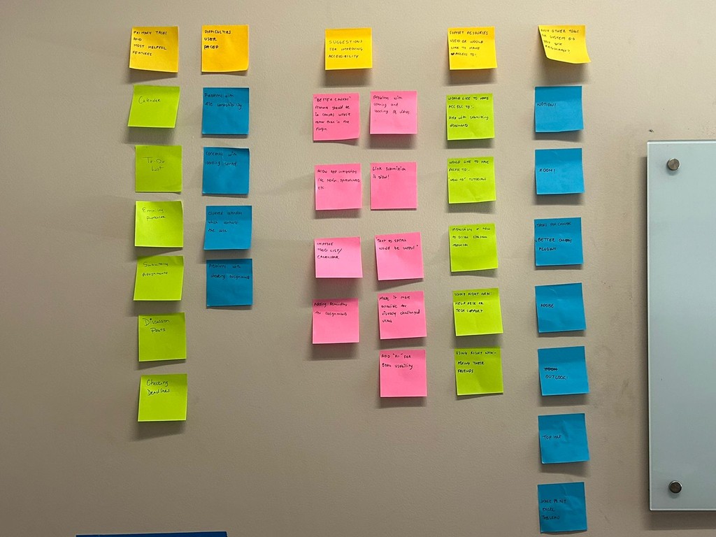
Primary Research
Affinity Research
Redesigning the Canvas LMS to streamline navigation, improve visibility of course content and deadlines, and ensure layout consistency. The goal is to help students stay organized and manage their coursework with confidence.
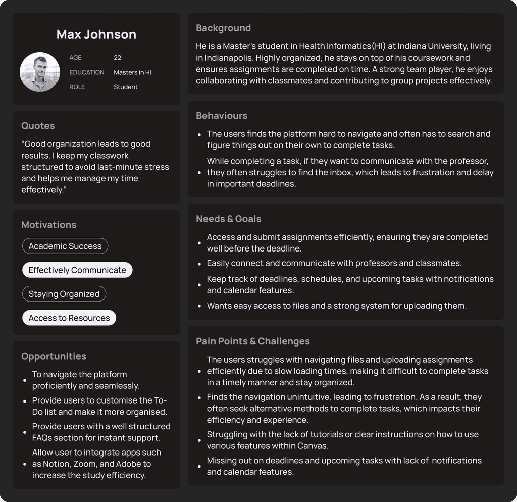
Persona
Key tasks we focused on
The Canvas app covers a lot, so we focused our redesign on three key tasks. These issues were most frequently reported in user feedback and were also the most significant pain points for students.

Emailing a professor
Creating a To-Do list
Submitting assignments
Areas of Improvement
We conducted a heuristic analysis along with primary research to identify key issues in the current Canvas experience and guide our redesign.
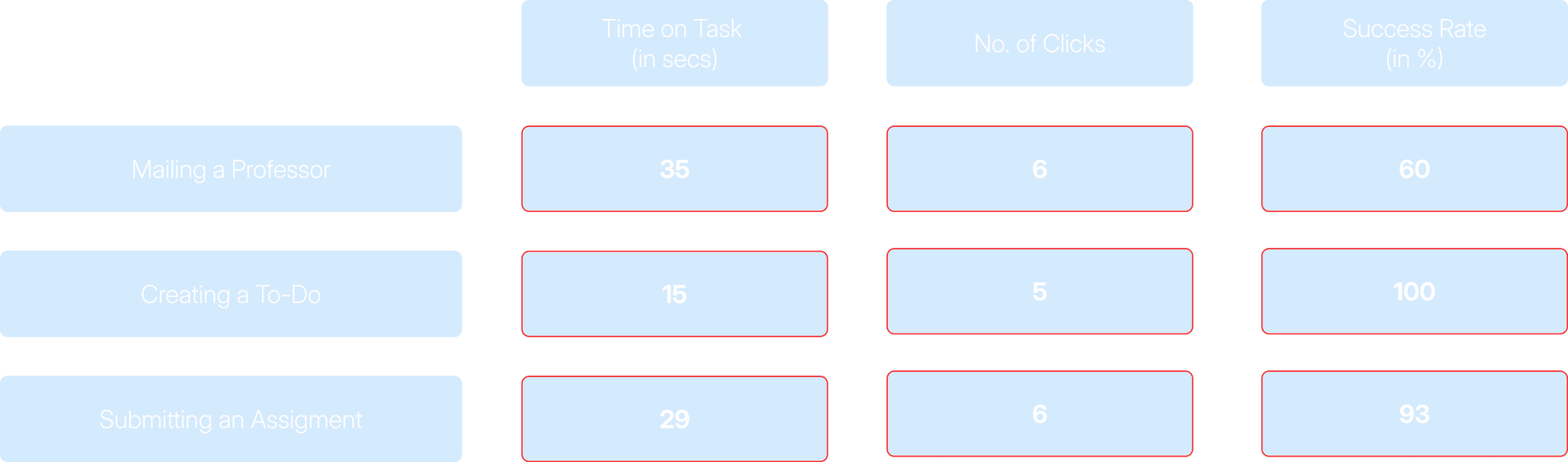
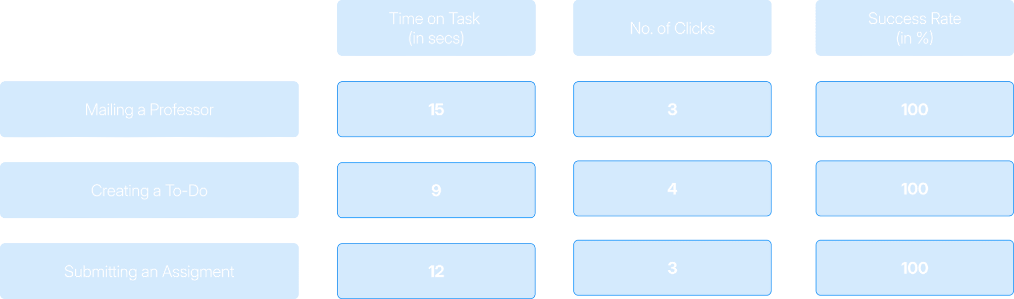
Improvement Metrics Used
We used these three metrics to measure our success on every level of the design phase.
Time on Task

Number of Clicks
Success Rate
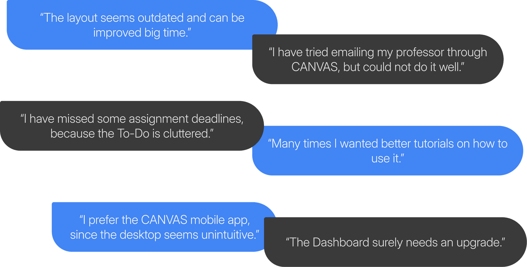
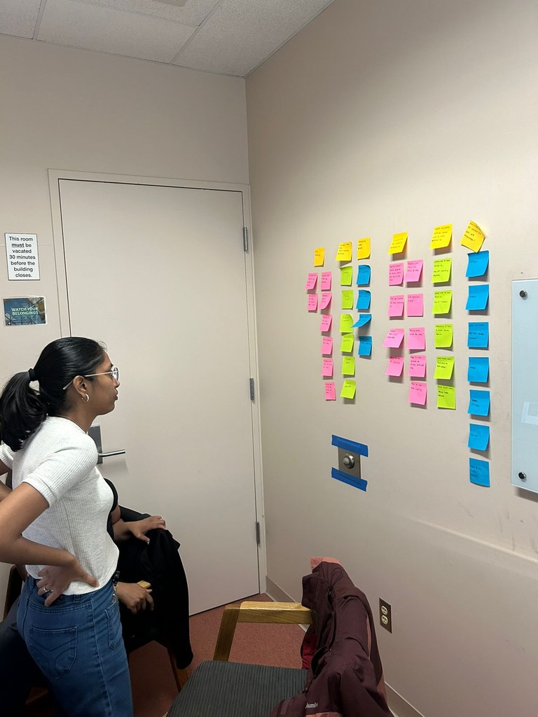
Observational Interviews
We also conducted 15 observational interviews with students around the IUI campus following the heuristic analysis, which helped us identify key areas where students were struggling.
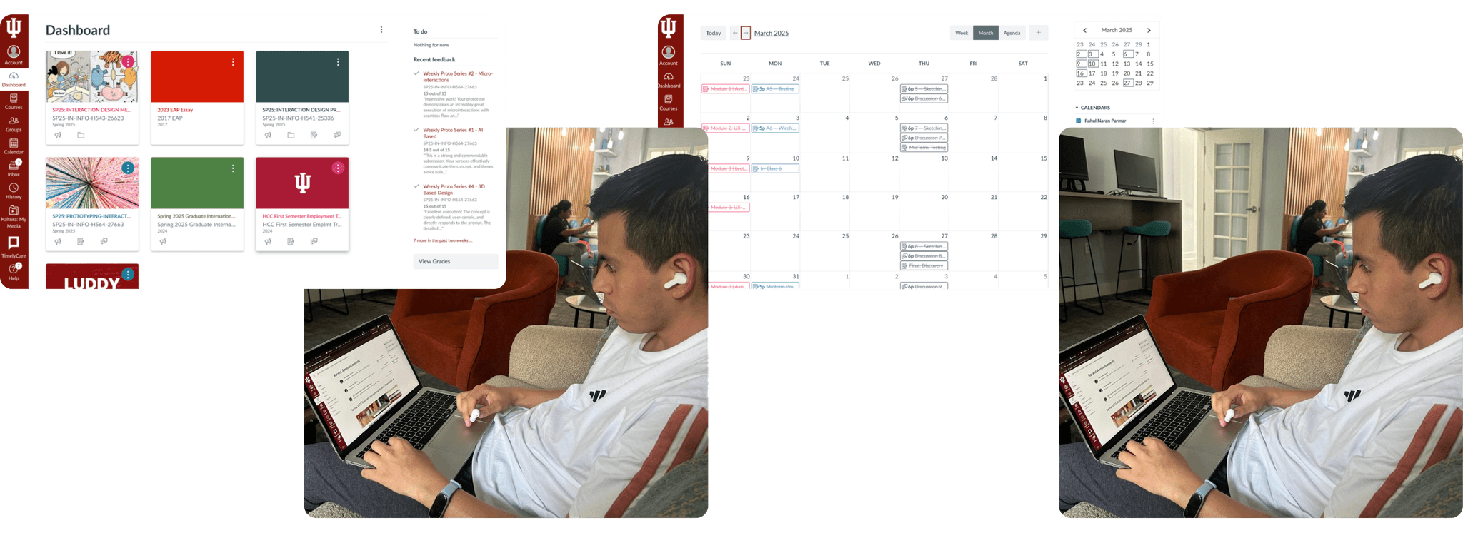
Feedback showed users often mistook the chat feature for the inbox, indicating confusion between the two.
Low Fidelity
Following the observational interviews, we had a strong foundation to build our low-fidelity prototype and conduct an initial round of testing with classmates.
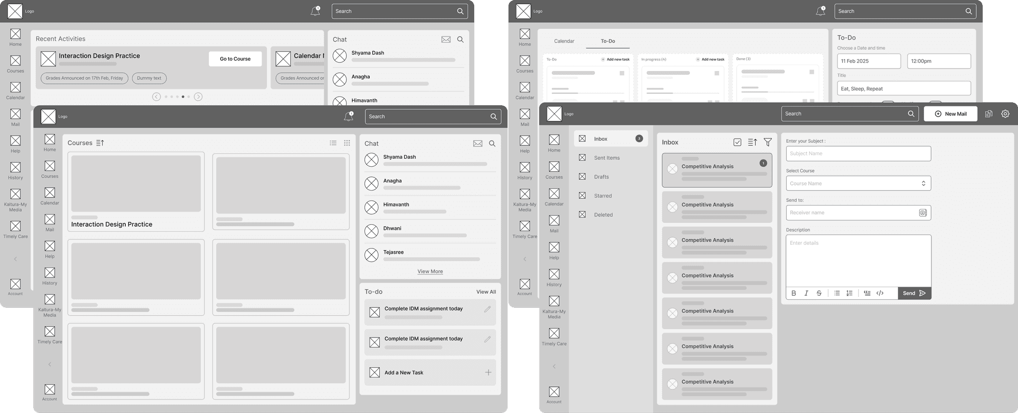

Mid Fidelity
Building on low-fidelity feedback, we refined our design and conducted 15 mid-fidelity testing sessions. Cursor tracking during these sessions revealed that many users still lacked confidence and felt unsure while making decisions.
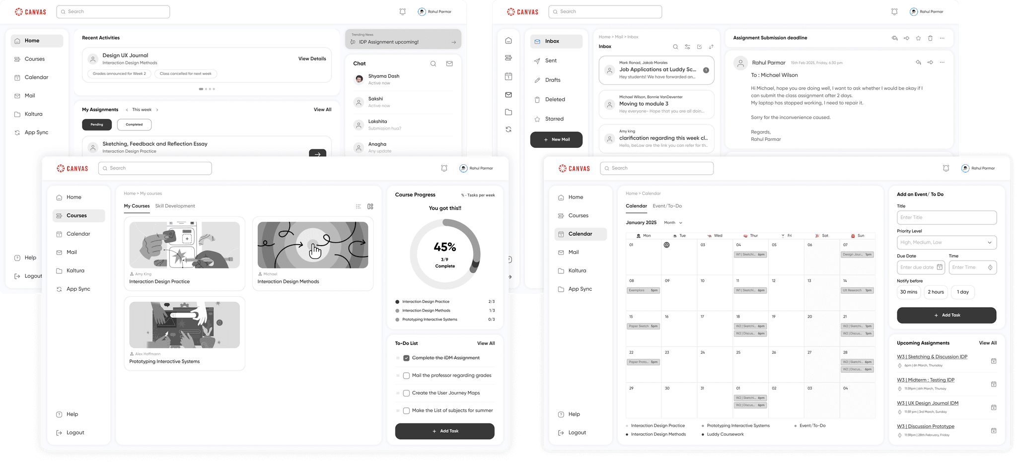
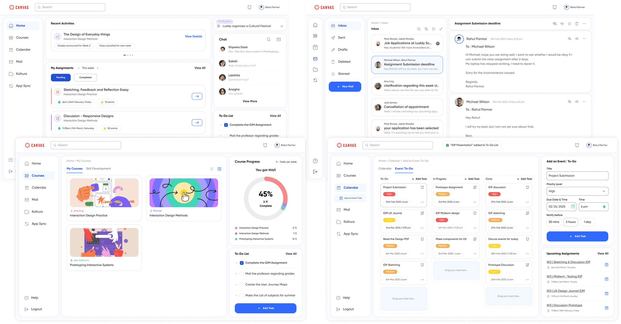
High Fidelity
Based on insights from mid-fidelity testing, we refined our high-fidelity screens to ensure smooth navigation, eliminate errors, and reduce the learning curve for users.

Impact and Improvements
The task completion time improved significantly from low to high fidelity testing, and also the students reported high satisfaction with the seamless experience during the final testing sessions.
77.1%
improvement was observed in Task 1 completion time from Baseline.
66.7%
improvement in success rate for Task 1 from baseline.
50%
reduction in clicks for Task 1.
53.3%
Improvement was observed in Task 2 completion time from Baseline.
100%
improvement in success rate for Task 2 from baseline.
40%
reduction in clicks for Task 2.
75.9%
improvement was observed in Task 3 completion time from Baseline.
7.5%
improvement in success rate for Task 3 from baseline.
50%
reduction in clicks for Task 3.
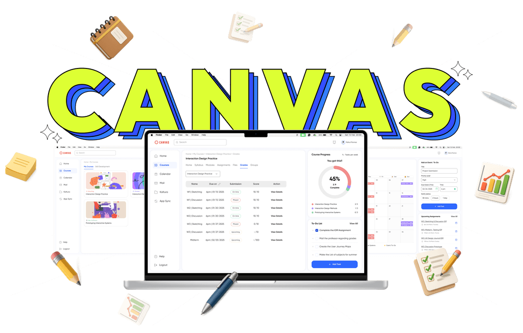
Final Product
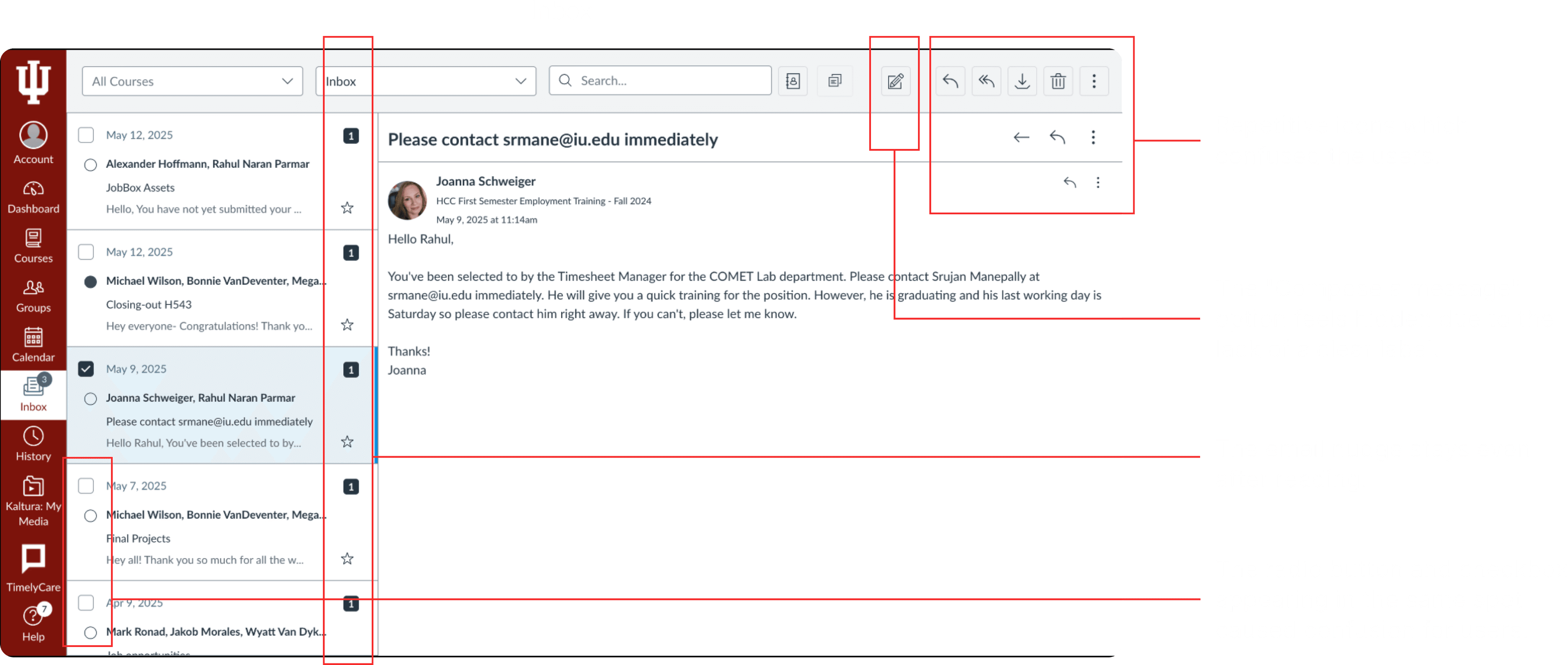
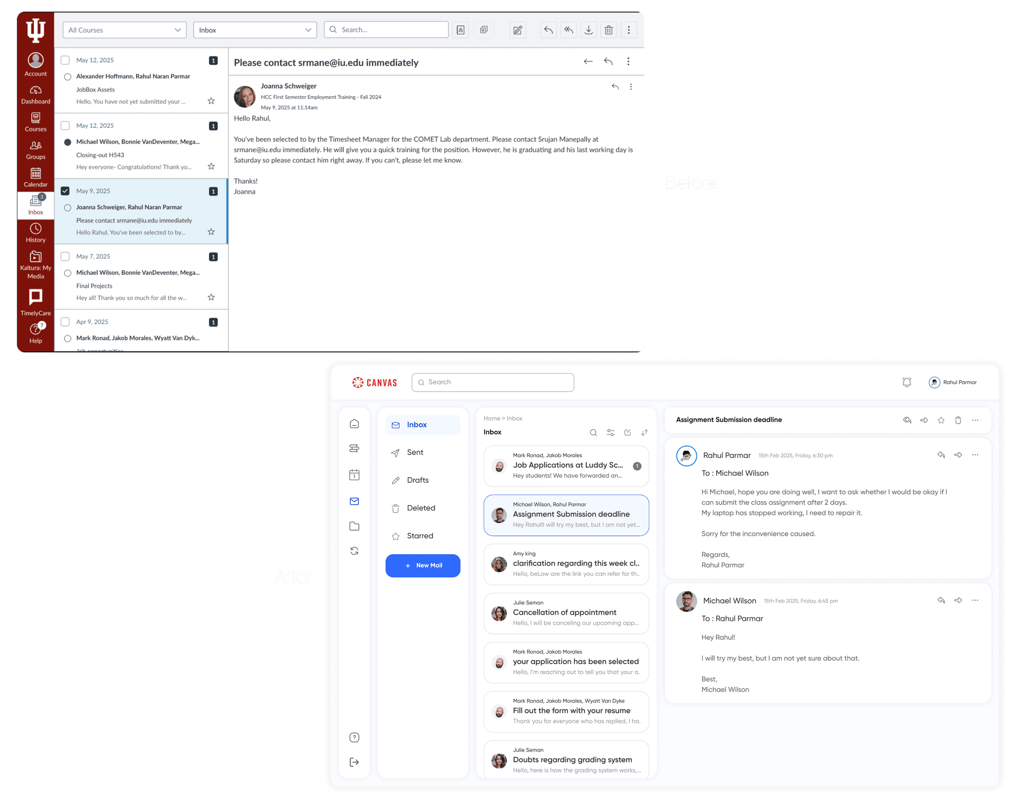
Mail/Message
To reduce the learning curve and improve usability, we redesigned the Inbox with a familiar layout inspired by tools like Outlook and Gmail. This declutters the UI and makes composing messages intuitive.
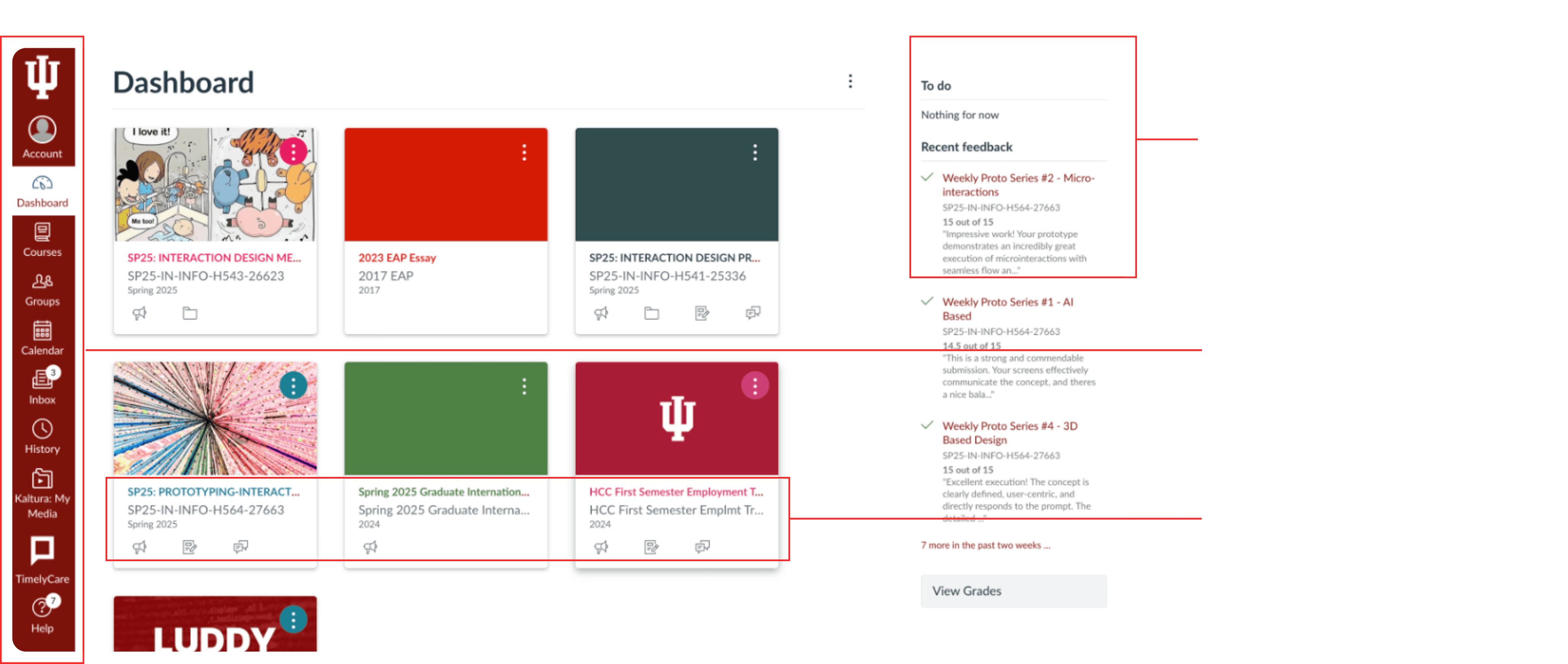
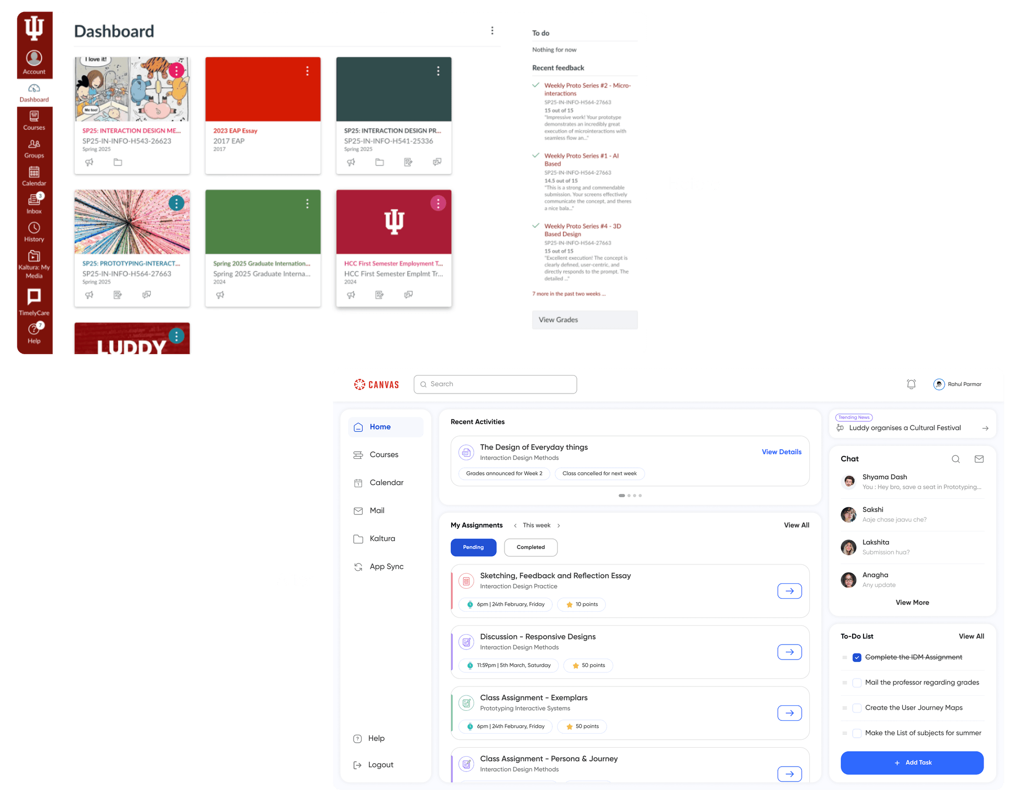
Homepage
To reduce the learning curve and improve usability, we redesigned the Inbox with a familiar layout inspired by tools like Outlook and Gmail. This declutters the UI and makes composing messages intuitive.
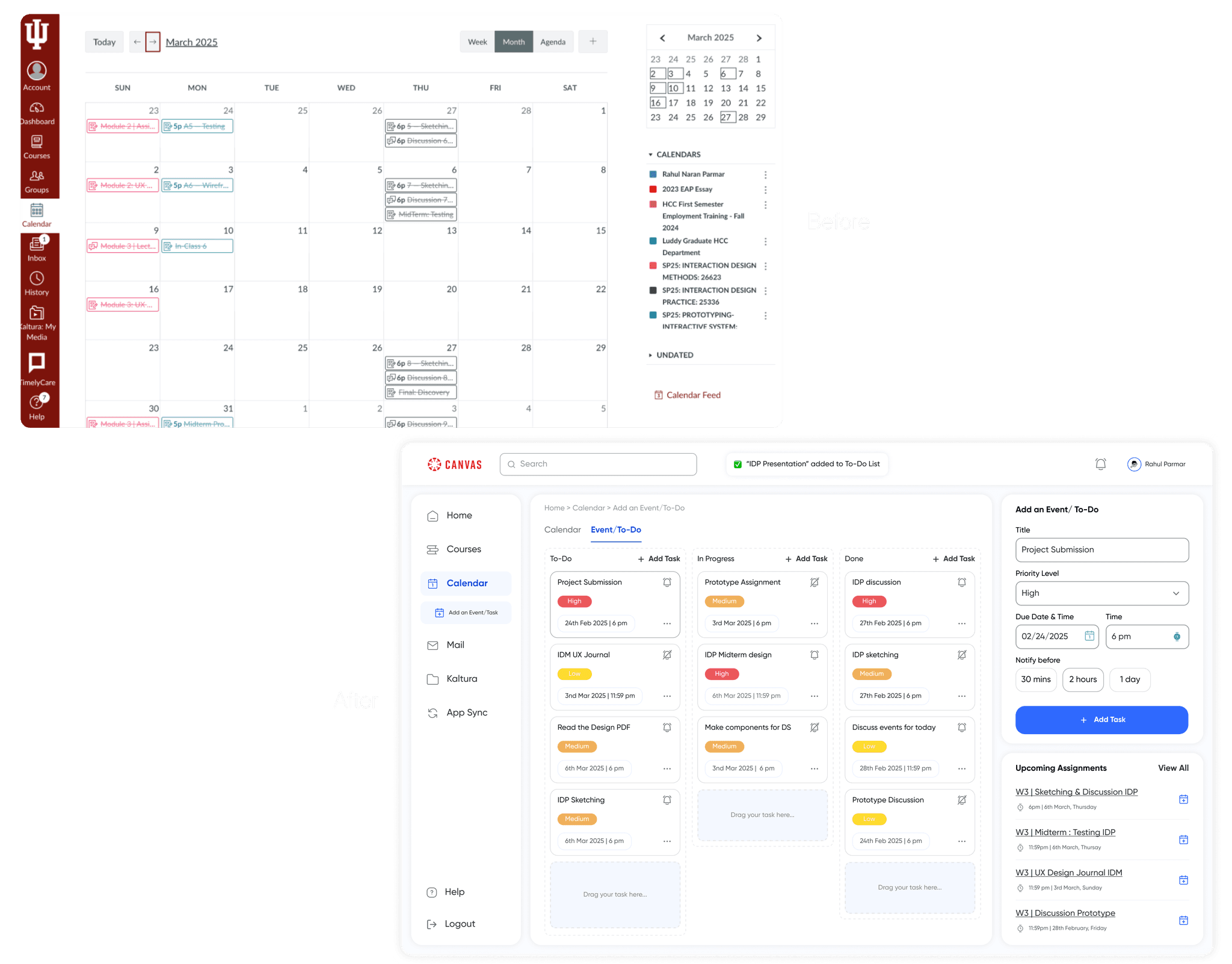
Calendar and To-Do
We streamlined task management by allowing students to add assignments directly to their To-Do list via the calendar icon. With just a few clicks, users could set reminders, choose priority levels, and customize notifications. This makes the To-Do feature more accessible, actionable, and integrated into their workflow.
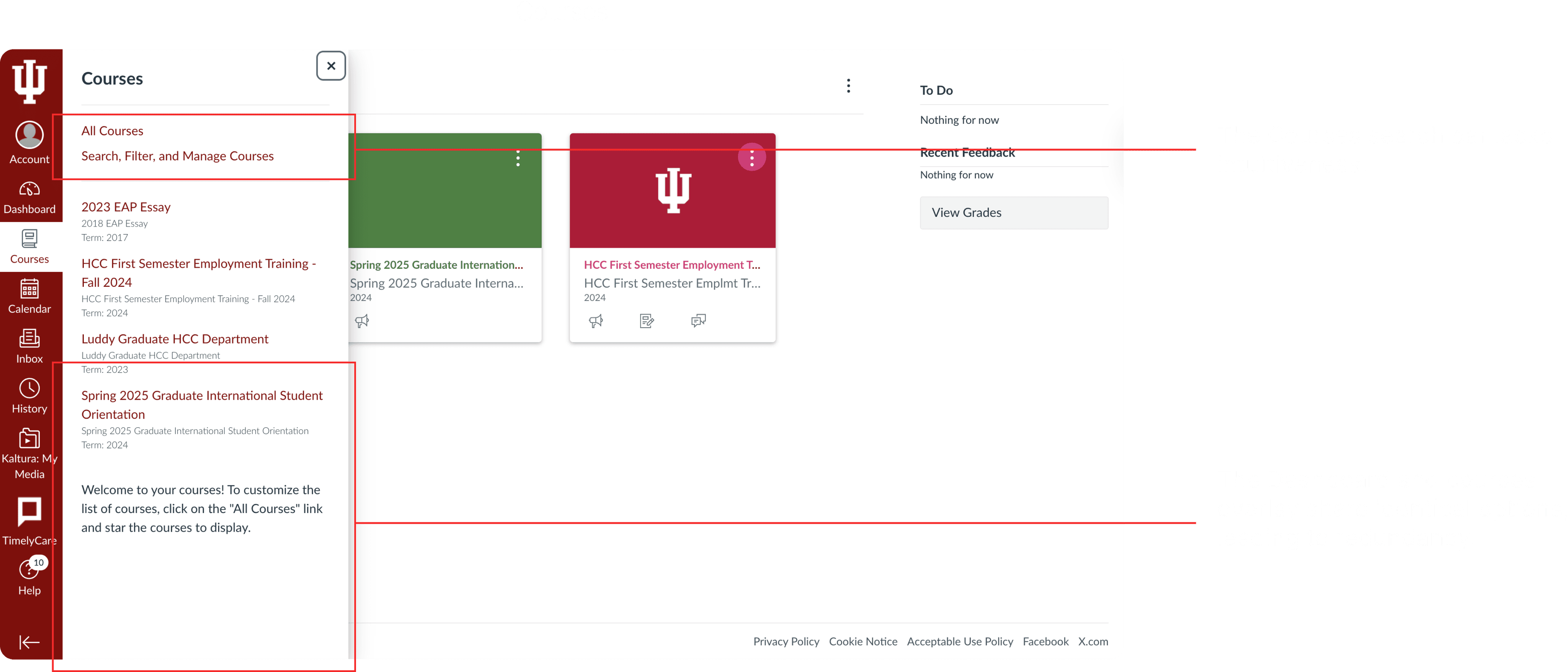
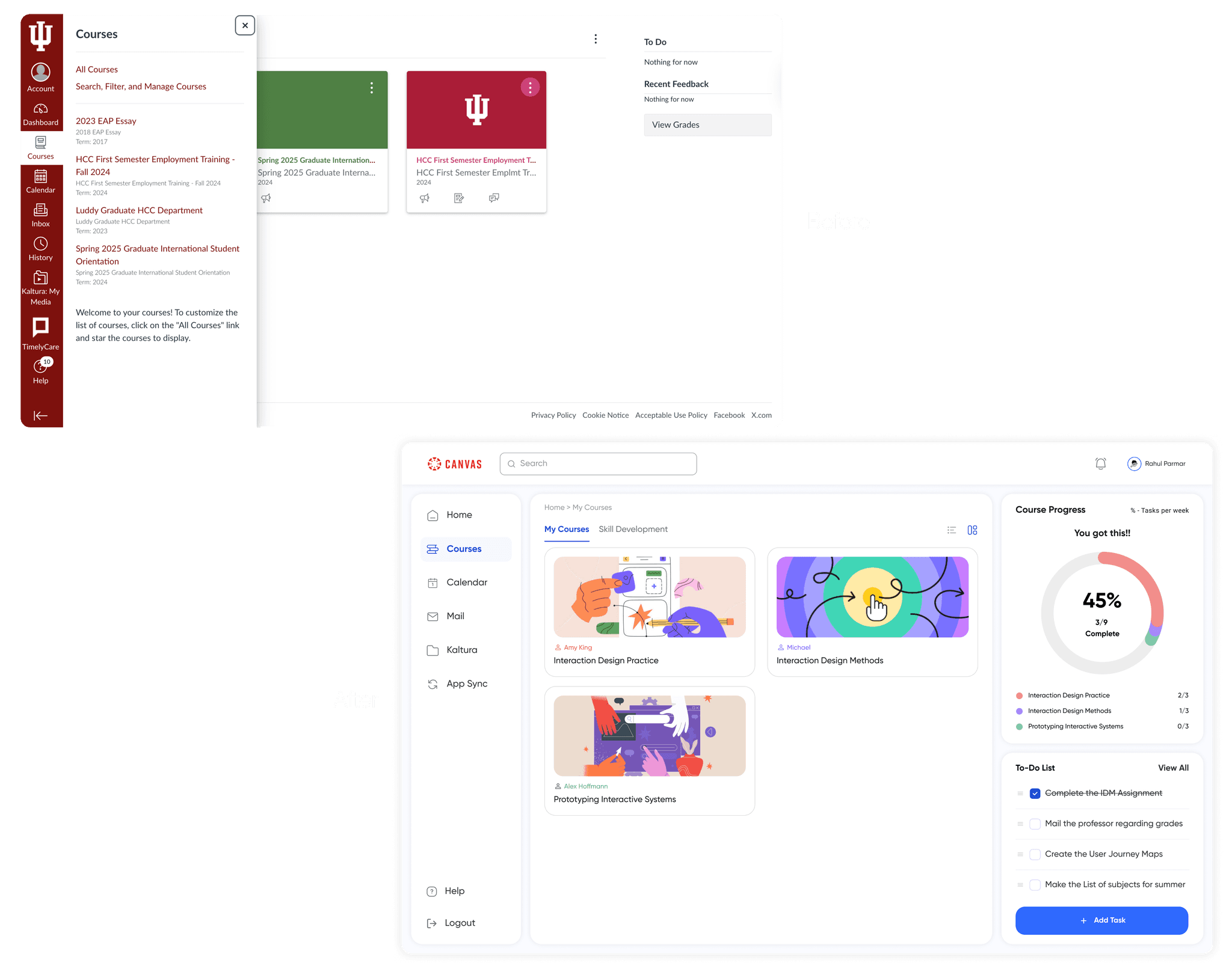
Courses
We separated academic and skill development courses, creating a dedicated course page with weekly progress shown through color coding for clarity.
Learnings & Challenges
I learned how to collaborate effectively and work as part of a team for this project.
Gained confidence in approaching students on campus for user testing, having empathy towards them.
I strengthened my communication skills through interviews and observational research.
Learned to analyze usability metrics and track improvements across testing rounds.
View more case studies