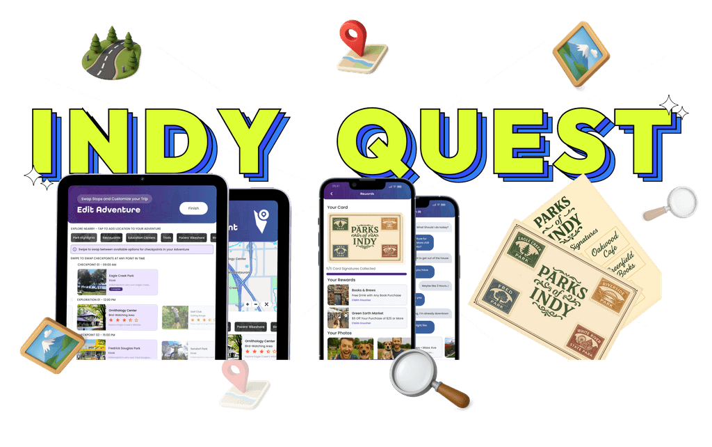
Reimagined City Navigation into a Gamified Exploration Experience
My Role
Research and Design
Project Type
Class Project
Timeline
2 months
Team
Shruti Ramagude, Rhea Mittal, Shubhangi Piya, Rahul Parmar
Project Overview
IndyQuest is a hybrid exploration system that turns navigating Indianapolis into a collectible-driven adventure. Through a mobile app and kiosks, users complete themed quests, collect digital stamps, earn badges, and discover cultural landmarks and hidden gems. This transforms city travel into a curious, interactive experience.
Problem Statement
Navigation apps get you from A to B, but miss everything in between.
How might we create a seamless experience that helps people explore and discover their surroundings through interactive, collectible-driven exploration without juggling multiple apps?
Design Exemplars
We conducted design exemplars to benchmark how different apps approach exploration, navigation, and gamification. This helped us identify common patterns, understand what works well, and draw inspiration to shape IndyQuest’s unique experience.
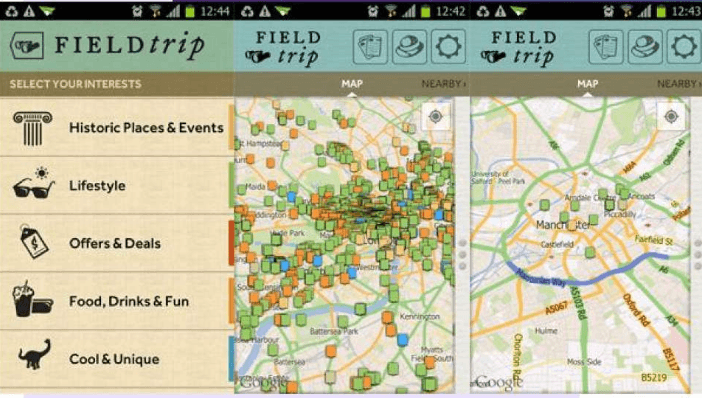
Field Trip by Niantic
A mobile app that alerts users to nearby landmarks and hidden gems, encouraging spontaneous discovery on the go.

Geocaching
A global treasure hunt app using GPS for finding and hiding caches, fostering real-world exploration.

Pokemon GO
This app combines physical exploration with gameplay, urging players to visit real locations to catch virtual Pokémon and advance.
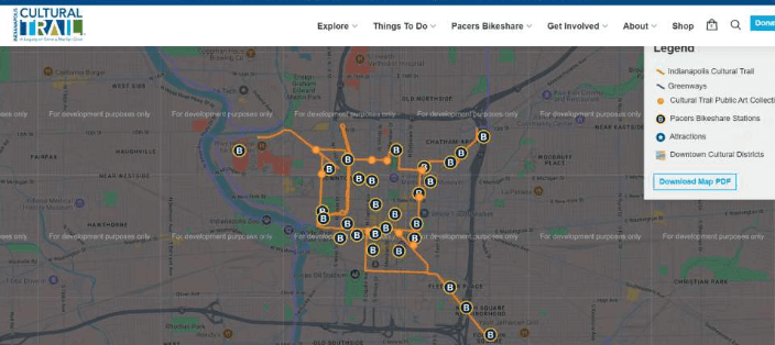
Indianapolis Cultural Trail
The Indy Cultural Trail app guides users along an 8-mile path linking parks, art, and culture, promoting discovery of local gems and history.
Personas
For this assignment, we focused on exploring the diverse spectrum of Indy urban explorers. First-time travellers, casual day-trippers, and locals. We interviewed two individuals from each of these personas to understand their needs and challenges.

Andrew - Day Trip Explorer
Excited but overwhelmed, as he wants to do something cool, but doesn’t want to spend all day figuring it out

Amy - First Time Explorer
Often feels disoriented and anxious while navigating alone, but perks up when she sees a familiar face.

Ruby - Local Explorer
Craves serendipity and exclusivity and is most engaged when she stumbles on something unexpected.
Our Process
We followed a structured process in this project, conducting multiple rounds of testing. We tested from the original system to low-fidelity, mid-fidelity, and beyond. At each stage, we gathered data and analyzed it to measure our improvements.

Research
Define
Ideate
Design

Test
Framing the Problem
Most wayfinding tools guide users from point A to B, but our project focused on what happens in between. Interviews with newcomers and locals revealed a need for a dynamic system that supports real-time discovery, not just static directions.
Research and Insights
We interviewed six users from three personas—first-time travelers, day-trippers, and locals. We identified pain points like difficulty finding hidden spots, juggling multiple apps, and missing real-time cues. This inspired us to see exploration as a layered journey, not a linear path.
Design Approach & Concept
“Exploring a city should be more than just reaching a destination—it should feel like an adventure.” This was our guiding principle throughout the project.
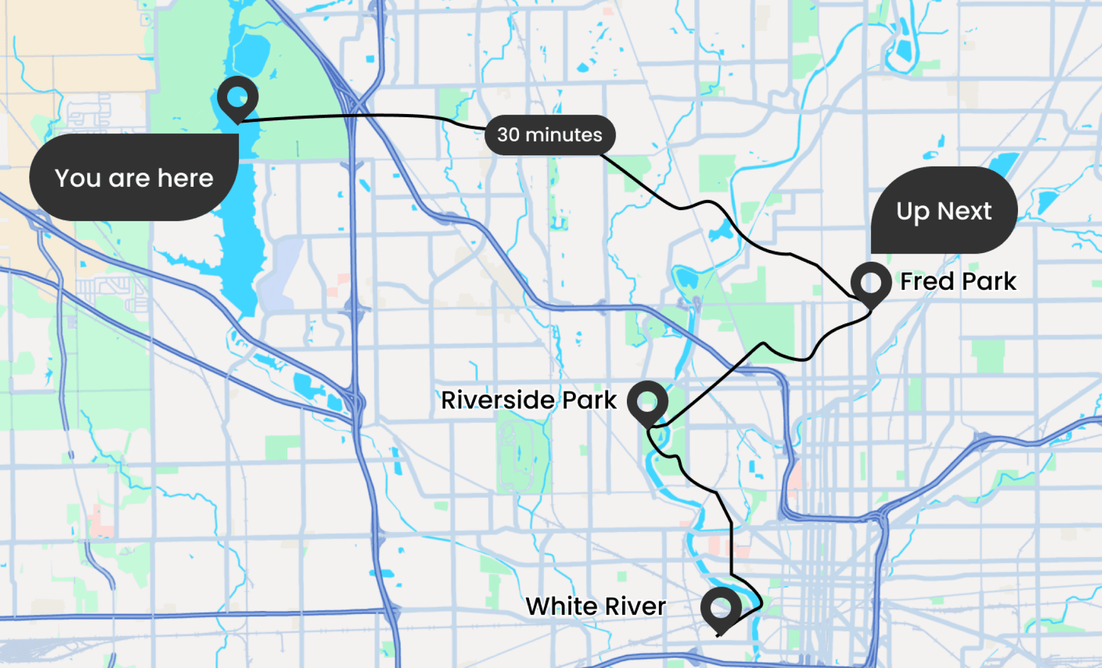
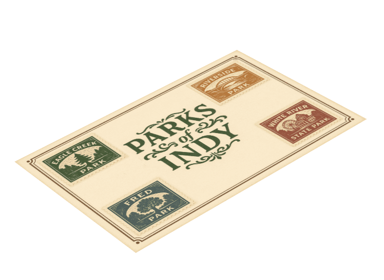
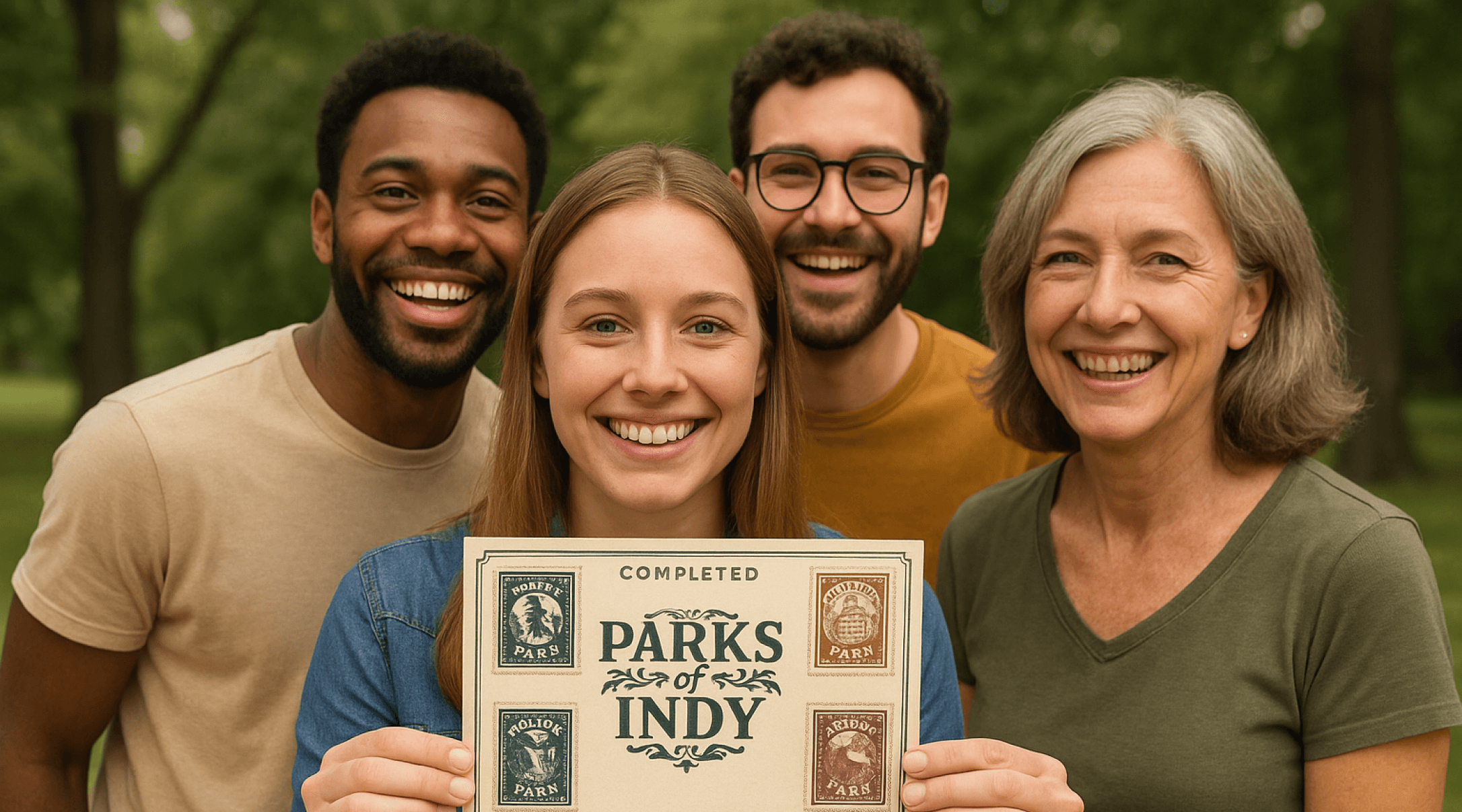
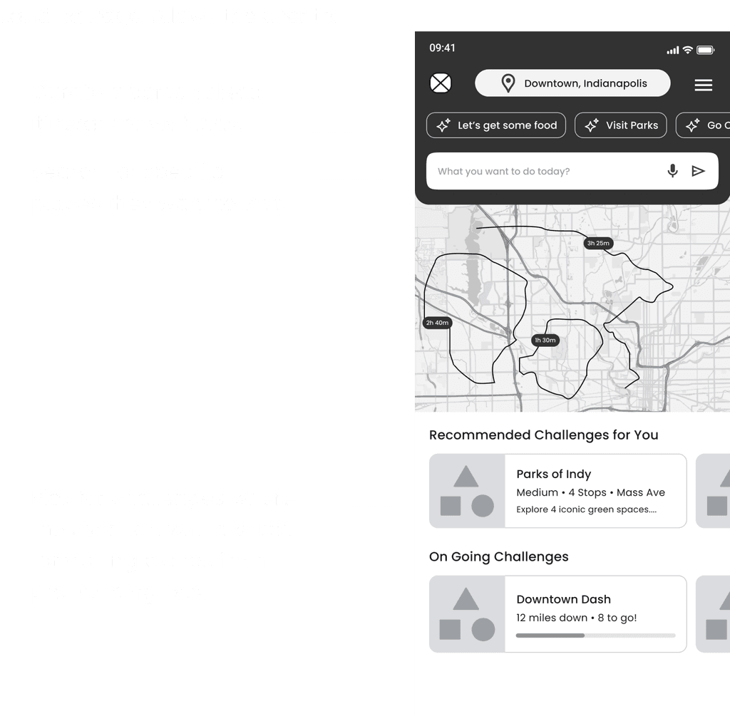
We created IndyQuest, turning the city into a gameboard with digital navigation and physical kiosks. It offers themed trails, stamp collections, discovery of hidden gems and local businesses, and rewards the journey itself.
Key Ideas and Features
Adventure-Based Exploration
Instead of just giving directions, IndyQuest lets users go on themed adventures around Indianapolis. Each one starts at a kiosk where they get a postcard, and as they visit different places, they collect stamps to complete a fun goal.
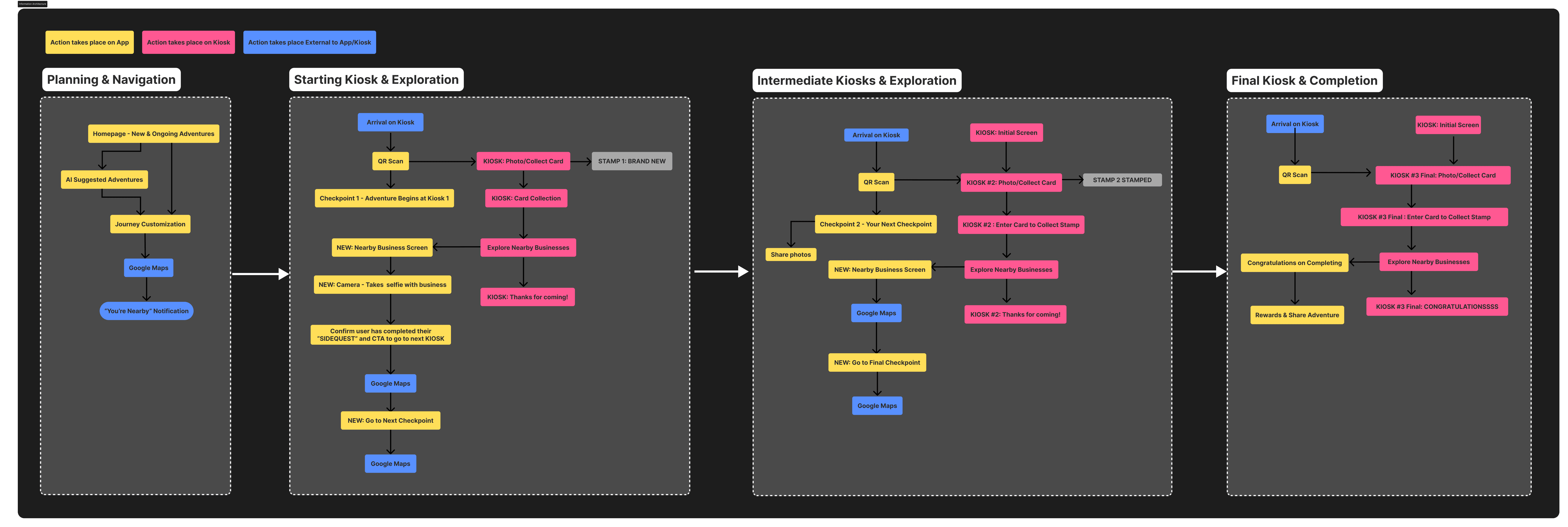
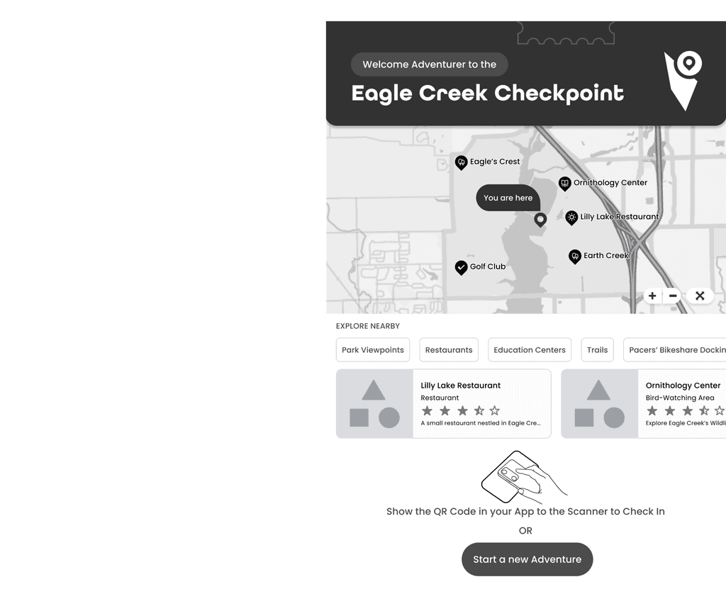
Hybrid Physical-Digital Interaction
IndyQuest combines a mobile app with real-world kiosks. At each kiosk, users can collect stamps, take photos, and get live updates. The app helps them plan their trip, track progress, and celebrate milestones, making the experience both physical and digital.
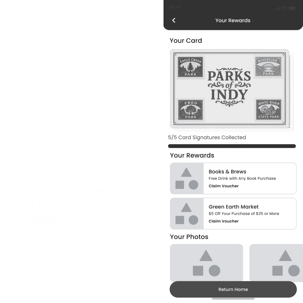
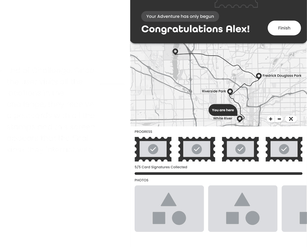
Delightful Achievement System
To make exploration more fun, IndyQuest uses gamification. Users earn stamps, unlock badges, and take photos at each stop. This creates a sense of accomplishment that’s instant, shareable, and connected to real places they explore.
User Journey Phases
As users move through each kiosk, it feels like leveling up in a game. Along the way, they connect with local spots and collect small souvenirs, turning their journey into a story they can keep.
click to expand
Low Fidelity Sketches

We began by imagining how to make city exploration playful and meaningful. Through sketches and team brainstorming, ideas like trails, stamps, and story-driven kiosks came to life. With each step, user feedback helped shape IndyQuest into a journey of discovery and delight.
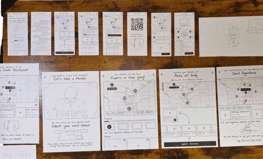
Paper Prototype
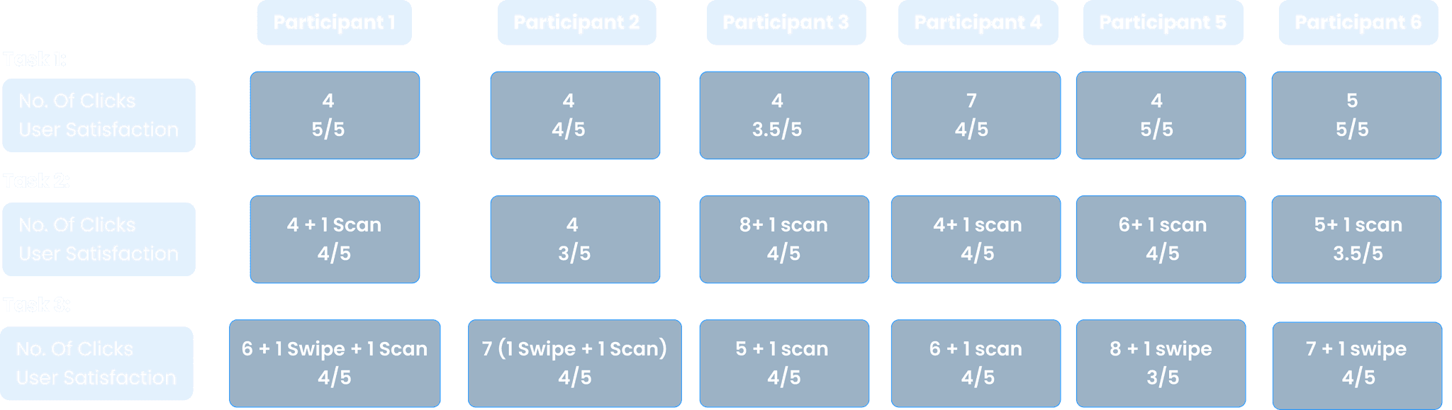
We created low-fidelity paper prototypes to test navigation and kiosk flows, which helped us gather both qualitative and quantitative insights from users.
Task we focused on
Task 1
You are in Indianapolis, ready to explore the city using the app to select today’s adventure.
Task 2
Navigate to the first Checkpoint kiosk, check in at the Kiosk and collect your postcard.
Task 3
Find a local restaurant to go to near the kiosk for a signature from the owner.
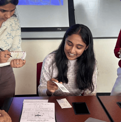
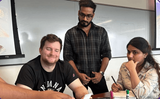
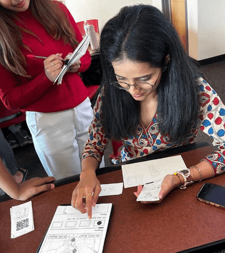
Paper Prototyping Testing
We created low-fidelity prototypes for the mobile app and kiosk, focused on the first checkpoint experience.
User testing revealed that:
Navigation-heavy tools and AI features led to cognitive overload and disrupted the intended exploratory feel.
Reward-based elements like stamp collection, progress tracking, and badges boosted engagement and satisfaction.
We gathered insights through task-based usability tests and observation.
Low Fidelity Results
Participant 1
No. of Clicks
5 + 1 Scan
User Satisfaction
4/5
Feedback
The participant browsed options first and used AI only if none appealed. She was unsure of the search bar’s purpose, mistaking it for question input.
Participant 2
No. of Clicks
7 + 1 Scan
User Satisfaction
4/5
Feedback
The participant missed that kiosk check-ins earn stamps and suggested making stamps more visible and moving AI or rewards to the top for easier access.
Participant 3
No. of Clicks
7 + 2
Scan/Swipe
User Satisfaction
3/5
Feedback
The participant suggested using Google Maps for full directions, focusing the app on first/last-mile guidance with a “You Are Here” marker. They liked stamps, kiosk features, found the map intuitive, and were curious about AI.
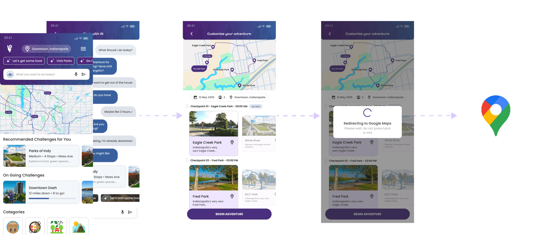
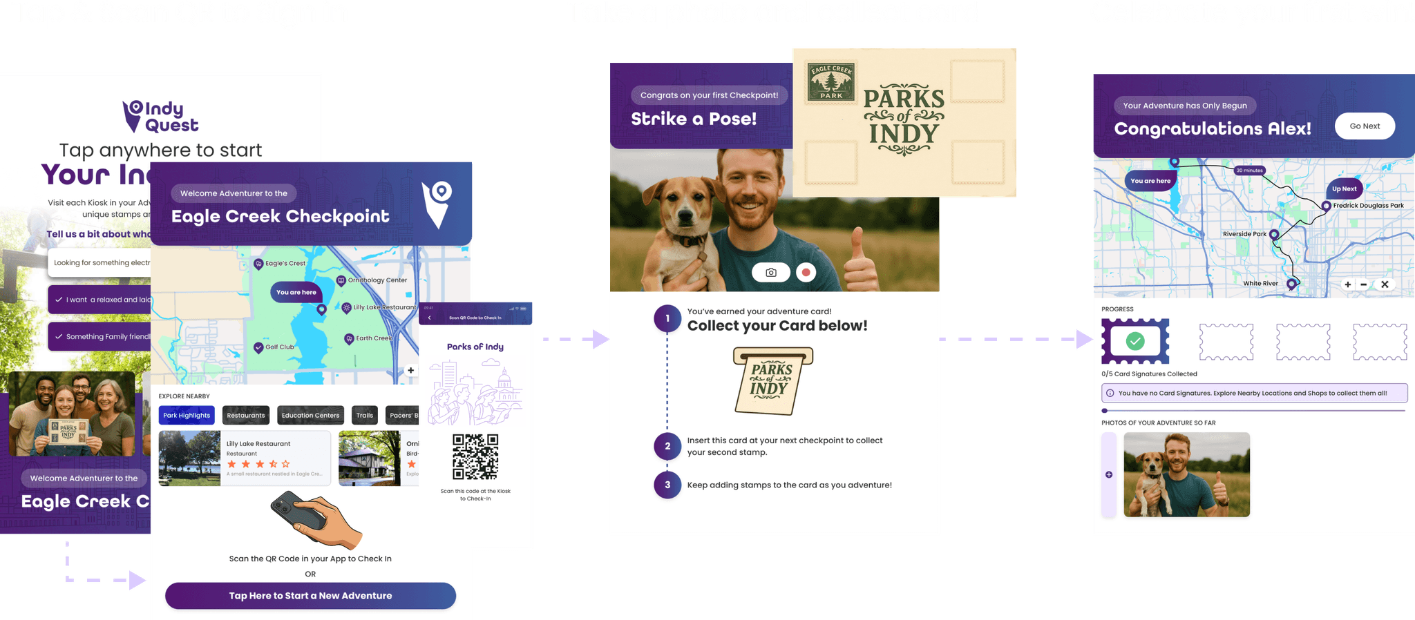
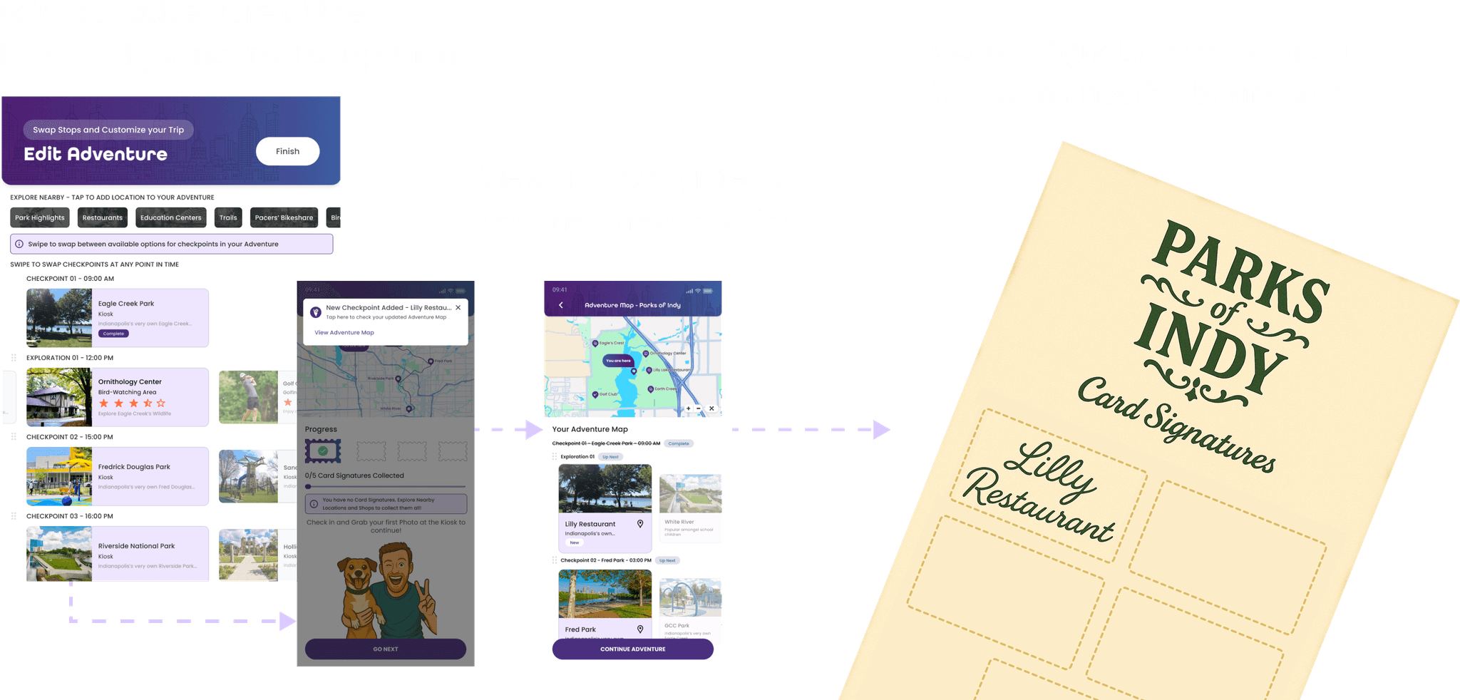
Mid Fidelity
Based on feedback and statistics from the paper prototype, we moved our focus from navigation to the adventuring aspect of the design, while improving the design fidelity and expanding the prototype to cover intermediate and final checkpoints. The following are a few key screens:
Mid Fidelity Testing
We retested 3 tasks with 6 participants to evaluate improvements made in the mid-fidelity update.
Key Takeaways into High Fidelity
From our mid-fi testing, the following are the takeaways we narrowed down on and marked as important to focus on while designing the high-fidelity iteration of the design.
Positive Takeaways:
- Dual-platform access appreciated: Users liked being able to view trip details on both the kiosk and app.
- Bot for personalized adventure was a highlight: Seen as a useful and engaging feature.
- Overall design concept was appealing: Users found the idea of the app engaging and enjoyable.
- Stamps as a reward mechanism were appreciated: Multiple users grasped and appreciated this gamification element.
Points of Improvement
- Add visual indicators (e.g., bars or color highlights) to better communicate adventure progress.
- Make the map's purpose more explicit through contextual hints.
- Strengthen the kiosk’s unique value proposition on the home screen to immediately capture user interest.
- Provide soft guidance and feedback throughout the flow to help users understand next steps and system responses.
- Differentiate between similar concepts like cards and stamps using clearer language or illustrations.
High Fidelity
Learnings from this project
I gained experience in iterative prototyping and usability testing, refining designs based on participant feedback from low to mid fidelity.
Developed a deeper appreciation for user-centered design by focusing on how people discover and navigate in real-time, which made me rethink how navigation can feel more intuitive and less overwhelming.
I also learned how to design interactions that make key features like rewards and kiosk locations clearer and easier to use.
I became more comfortable leading research sessions and connecting with a wide range of users.
View more case studies