Redesigned payment experience, driving 43% higher engagement and cross-sell.
My Role
Product Designer
Timeline
3 months
Team
Multiple Product Manager (Horizontal Products - Wallet, UPI, Gift Card, etc), a team of 6 developers, Myself as a Product Designer
WHY A REVAMP?
Back in late 2022, we noticed a clear pattern in our internal transaction data—users were dropping off during key moments in and after their transactions. Bajaj Pay had added over 9 million new users that year, but the core experience wasn’t scaling with them. The transaction screens, which should have been the most intuitive part of the app, felt cluttered, inconsistent, and hard to follow. Ultimately affected the overall business performance and revenue.
Project Goal
Our goal was to turn transactional friction into an opportunity for better engagement.
"How might we streamline content, improve consistency, and make support more accessible to enhance UX and drive cross-sell?"
Uncovering What Was Broken
We began by triangulating data from three key sources: support ticket logs, session heatmaps, and usage analytics. Across a sample of over 2,000 sessions and 300 support queries analyzed over 30 days, patterns of frustration began to emerge:
61%
of users who experienced a failed transaction, did not engage with the support button. Due to lack of visibility or unclear guidance.
46%
of users revisited transaction screens multiple times, often hovering over redundant data (like amount or order IDs), signaling confusion.
52%
of sessions showed no action post-transaction. This indicated a lack of contextual next steps or engagement.
15%
The average banner click-through rate. This low engagement pointed to poor visibility and weak placement within the user journey.
Existing Screens Drawbacks
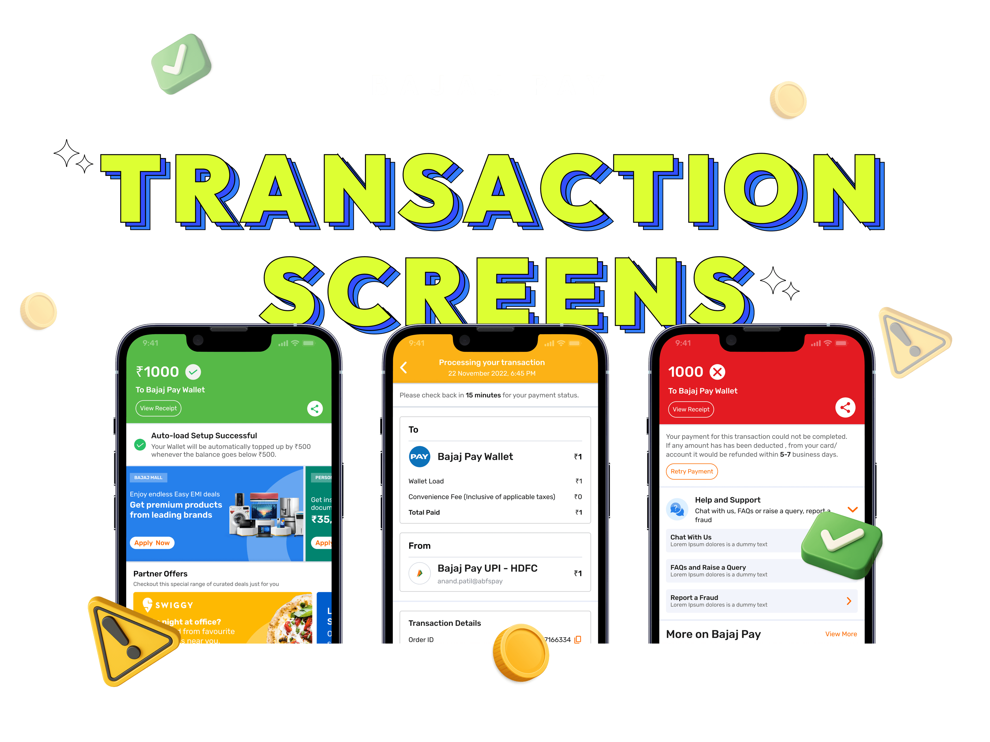
We decided to revamp all three transaction status screens (Success, Failure, and Processing) for a more consistent and improved user experience.
This is the Success transaction screen users saw when their payment was completed.

This is the failed transaction screen users saw when their payment couldn’t be completed.

Business Challenges
Despite rapid user growth, the transaction experience wasn’t keeping up, affecting key business metrics like Gross Merchandise Value and cross-sell revenue.
Our analysis revealed five major challenges:
Declining GMV due to poor UX
A clunky, inconsistent transaction flow caused user friction and drop-offs, reducing overall volume.
Low impact of promotional banners
Key business banners were buried in the scroll, limiting visibility and diminishing engagement.
Cross-sell friction
Users couldn’t easily access offerings like Bajaj Mall, Loans, or Insurance, leading to missed monetization opportunities.
Weak post-transaction engagement
There was no clear direction toward high-value actions like Wallet top-ups, UPI, or Bill Payments.

User Needs

Competitor Analysis
We benchmarked generative fintech experiences like PhonePe and Amazon Pay to reimagine our flows.

With over 500 million users, PhonePe sets a benchmark in fintech UX through real-time feedback, modular design, and smart in-flow CTAs.

Here's what we discovered from PhonePe:
Seamlessly Integrated Receipts
A minimal success screen (L1) confirms the transaction, with detailed receipts immediately accessible on L2.
Instant, Clear Feedback
PhonePe uses their backend infrastructure to deliver real-time status updates during and after payments, ensuring quick visibility of COMPLETED, PENDING, or FAILED states.
Persistent Contextual CTAs
Post-payment screens include secondary CTAs (e.g., “Invite to UPI Circle,” “Credit-on-UPI”), nudging users towards related actions without being disruptive.
Weak post-transaction engagement
There was no clear direction toward high-value actions like Wallet top-ups, UPI, or Bill Payments.

Known for its frictionless checkout and smart nudges, Amazon Pay integrates financial tasks into the broader shopping experience with minimal user effort.

Here's what we discovered from Amazon Pay:
Context-Aware Nudges
Amazon Pay uses transactional history to surface personalized suggestions like recharges, recurring bill payments, and offers which drives engagement post-transaction.
Seamless Redirection
After a transaction, users are intuitively led to explore related services (e.g., EMI offers, cashback rewards, or linked accounts), making every payment a discovery moment.
Eisen Hover Matrix

Our Process

Discovery

Define

Benchmark

Ideate

Design
Low-Fidelity Sketches

Design Iterations


Final Screens
We gathered feedback from design iterations, conducted competitor analysis, explored low-fidelity sketches, and prioritized both user and business needs and landed on these final designs.


Impact After Redesign
After the design revamp, we saw a significant improvement. Support queries dropped, customer usage increased, and business revenue saw a notable uplift. This was backed by data from support logs, session heatmaps, and usage analytics collected over 30 days.
15%
of users struggled to find help after a failed transaction (down from 61%), improving support accessibility.
12%
of users revisited processing screens unnecessarily (down from 46%), reducing confusion and friction.
78%
of sessions included meaningful post-transaction actions (up from 52%), boosting engagement with next steps.
82%
of users found the screens clear and trustworthy (up from 58%), reinforcing confidence and reducing errors.
What I learnt from this project
I gained deep understanding of user behavior after successful transactions and their next expectations.
I also managed to maintain design consistency across over seven horizontal products, which was challenging but essential.
Observed how thoughtful UX directly impacts business revenue by aligning user needs with cross-sell opportunities.
I realized how important it is to be a team player, staying in sync with different teams helped me access the right data and stay aligned.
Even learned to surface relevant, high-value actions based on previous user interactions (e.g., prompting Send Money after Add Money)
View more case studies